188 circa 2013/2014
Website Revamp, Banner Design
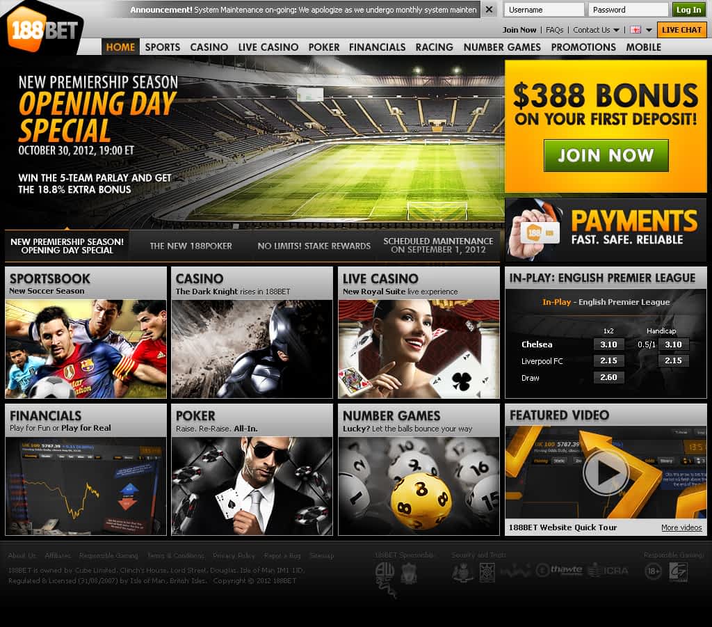
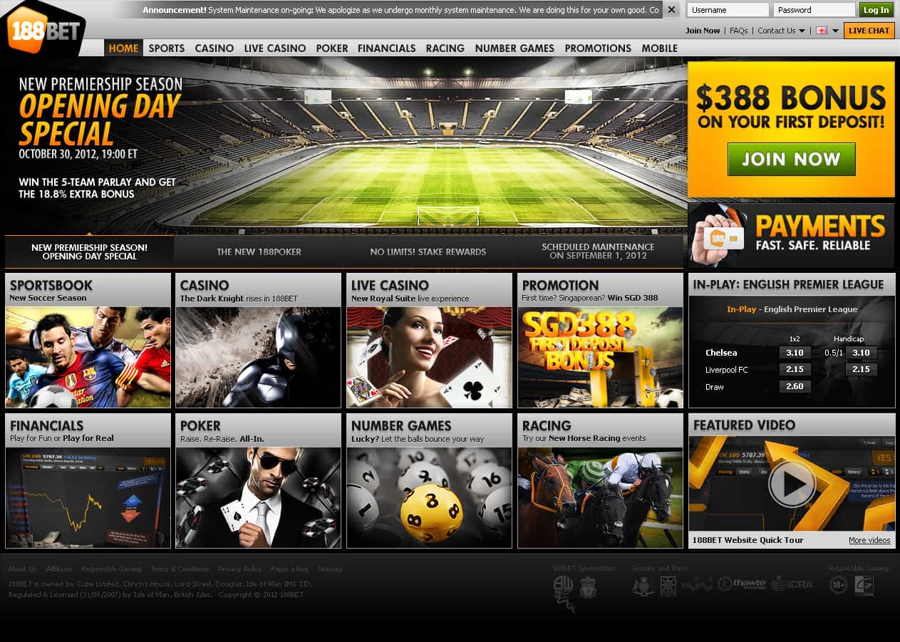
In 2013, 188BET underwent another website revamp. It was another fun time at work.
That time around, each member of the team was asked to design a concept. The winning design would be used for the new website.
One designer proposed a dark version, and another proposed a light version. So I went with a middle ground – a mix of light, dark, and gray. But the highlight of my concept was the expanding layout. The prevailing idea for betting sites back then was to maximize sales. The bigger the monitor, the more the site expanded to showcase products.


And the winner was… everyone! The team decided to combine the best elements of each concept into one website. Also, everyone couldn’t decide between a light and dark theme, so we decided to offer two versions of the site that customers could choose from. Oh, and my expanding layout idea was explored as well.
Year
2013 - 2014Company
188BETKey Responsibilities
Design, Web, Print, UI/UX, Branding, ConceptThe final part of the revamp was the banner brand design. Like the previous website, this new site’s main features and focus were the banners. Here’s the banner branding that I proposed.
Fortunately, this proposal was chosen and approved.
Another highlight that year was the billboard I created for Thailand (if I recall correctly). My concept was to design a billboard that would attract attention day and night. Instead of a traditional printed tarpaulin, I opted for a design with raised images to create a 3D effect. This made it appear as if the characters were emerging from LED-lit circles. At night, only the circles and characters were illuminated, giving them a floating appearance.
Disclaimer: I designed, conceptualized and/or led/worked with a team in the creation of these projects. Copyright belongs to the clients/employers whom I’ve created/distributed whilst employed/contracted at that time. I am posting them for the sole purpose of showcasing my skills and abilities, no infringement intended.


