Iceburg
Int’l Business Corp
In 2018, Flow Gaming’s operations moved to Taiwan. A new company was set up, and I was asked to design its logo and collaterals.
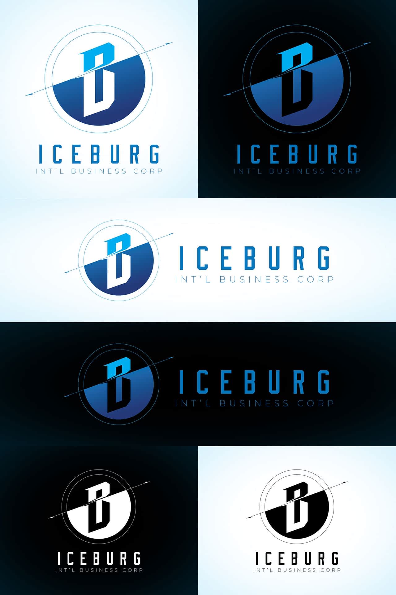
The name is Iceburg, and the main instruction was to avoid an overly exposed iceberg image.

When I design a logo, I usually incorporate meanings or reasons into every element. There are two key points in this logo. First is the subtle iceberg representation, where the larger part of the logo appears submerged underwater. Second is the use of the company name’s initials – I, I, B, and C.

Year
2018Company
IceburgKey Responsibilities
Design, Logo, Branding, PrintAs the company is located in Taiwan, it also required a Traditional Chinese version of the logo.

For the business card, I opted for a two-tone design – black on the front and white on the back. The black front features only the blue logo to make it eye-catching, while the white back displays the card holder information for a professional look.

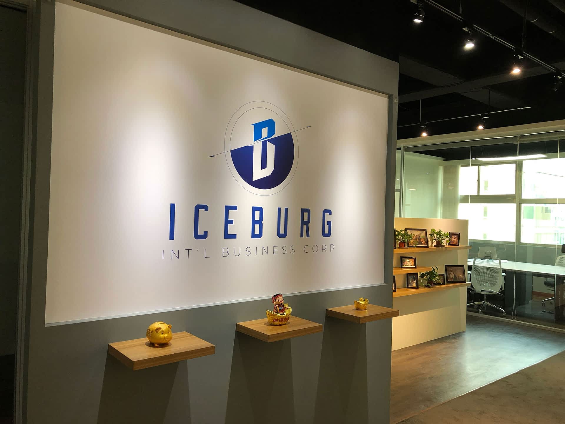
Here’s a photo of the wall logo that I designed for the office.

Disclaimer: I designed, conceptualized and/or led/worked with a team in the creation of these projects. Copyright belongs to the clients/employers whom I’ve created/distributed whilst employed/contracted at that time. I am posting them for the sole purpose of showcasing my skills and abilities, no infringement intended.


